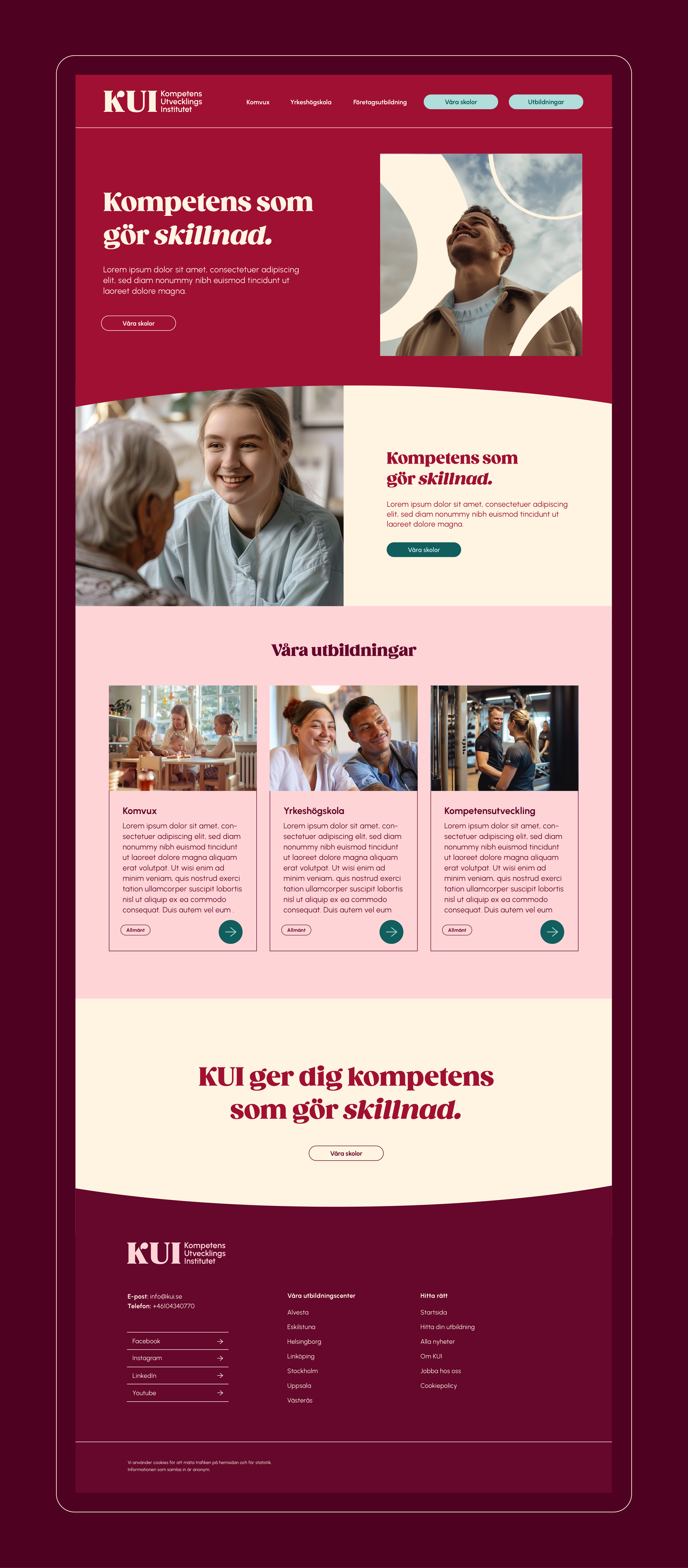
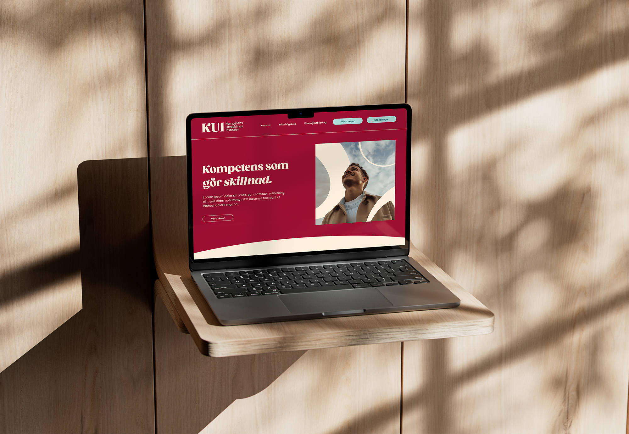
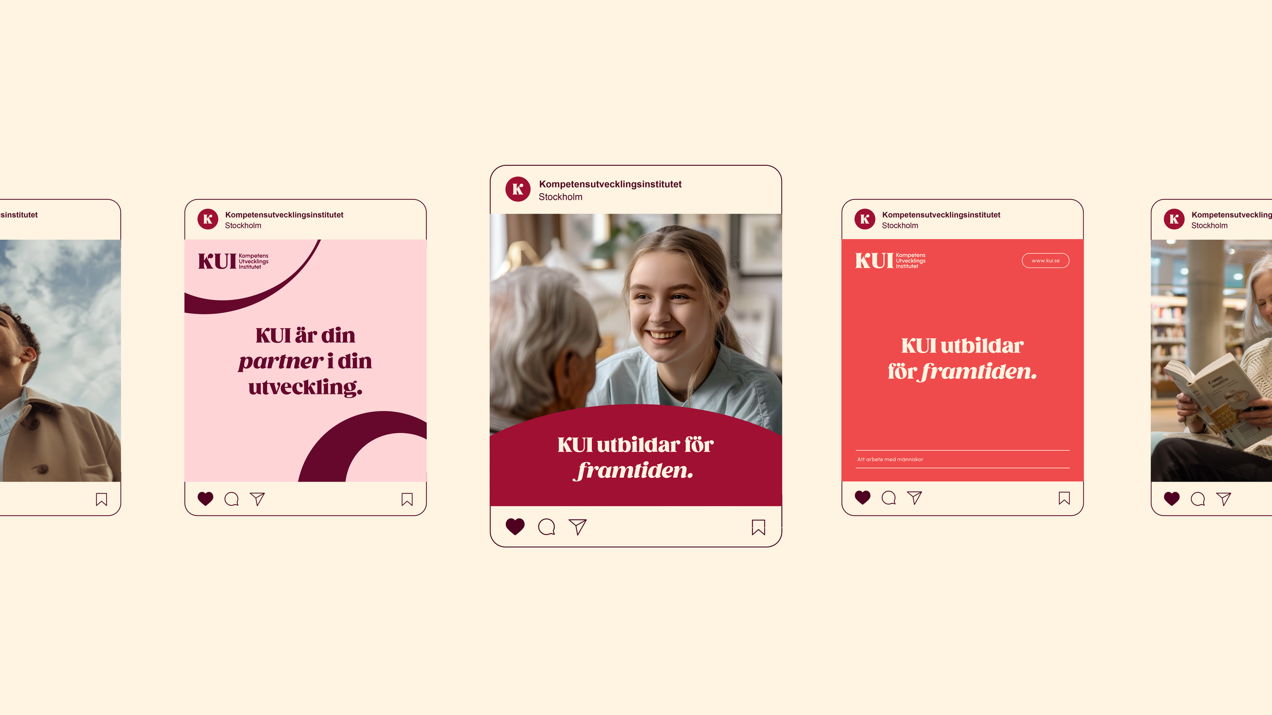
Designing a warm and inviting visual identity that reflects KUI's commitment to people-centered adult education.
KUI (Kompetensutvecklingsinstitutet)KUI is one of Sweden's leading adult education providers in healthcare, social care, preschool and school education, and leisure activities. KUI offers a wide range of programs and courses designed to meet the needs of today and tomorrow. By focusing on lifelong learning, KUI equips individuals with the knowledge, skills, and values needed for the future.
KUI’s primary goal is to provide their students with meaningful knowledge that not only benefits them personally but also their workplaces, the people they interact with in their professional roles, and society at large. They strive to offer education that has a positive and meaningful impact on both individuals and society.
Visual identityHow can we modernize and redesign KUI’s visual identity while keeping its core values and recognition factors?
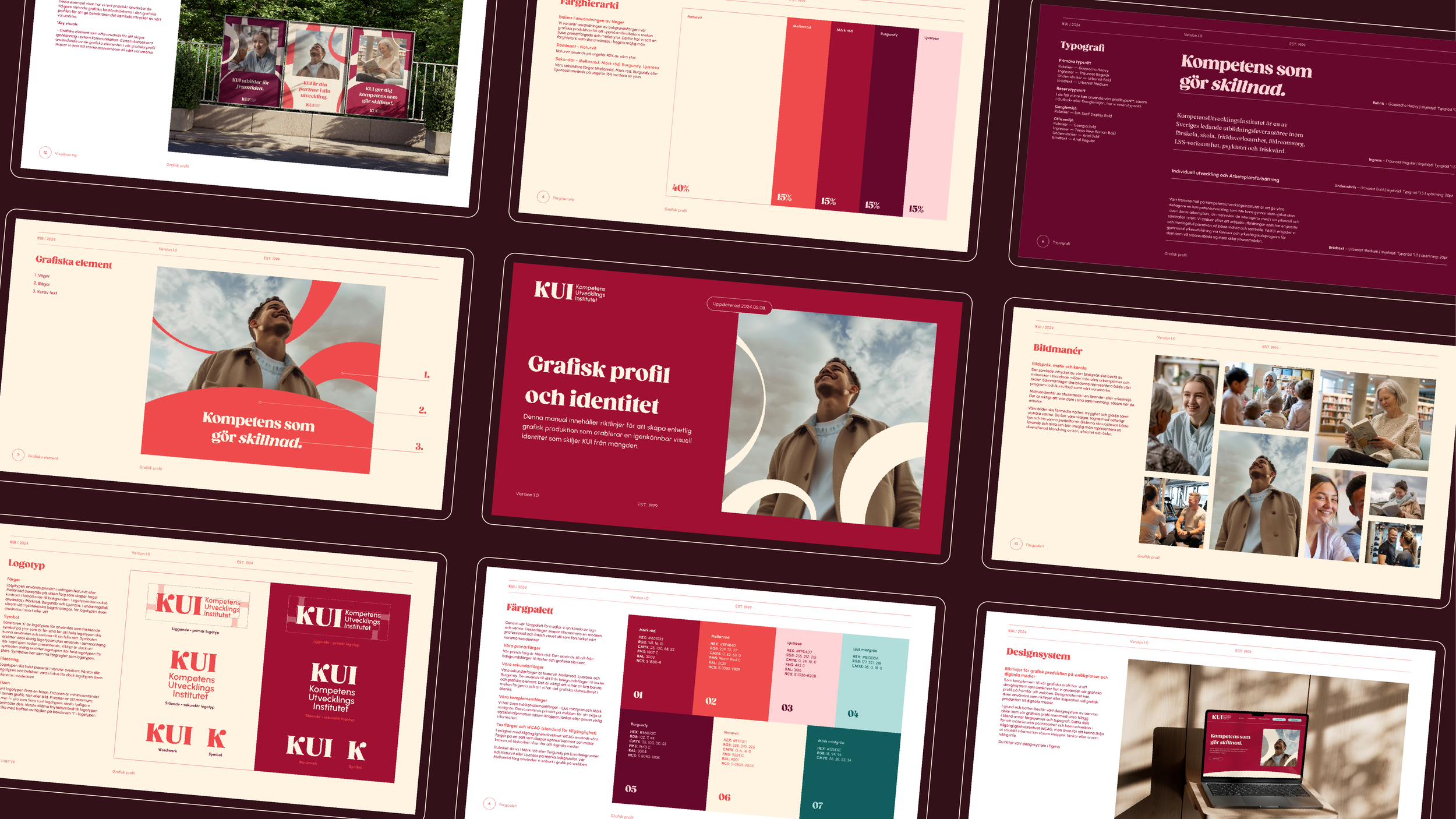
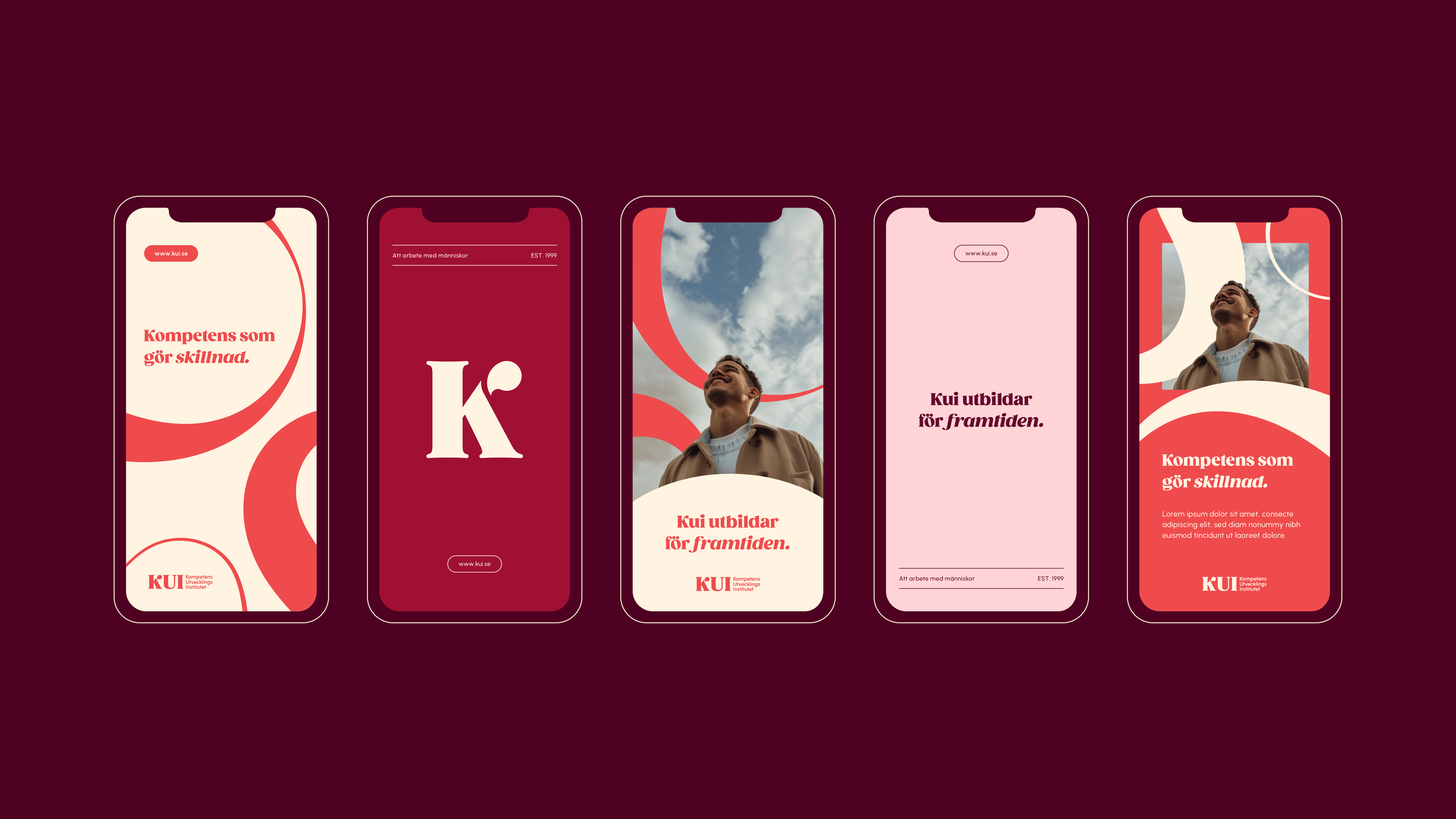
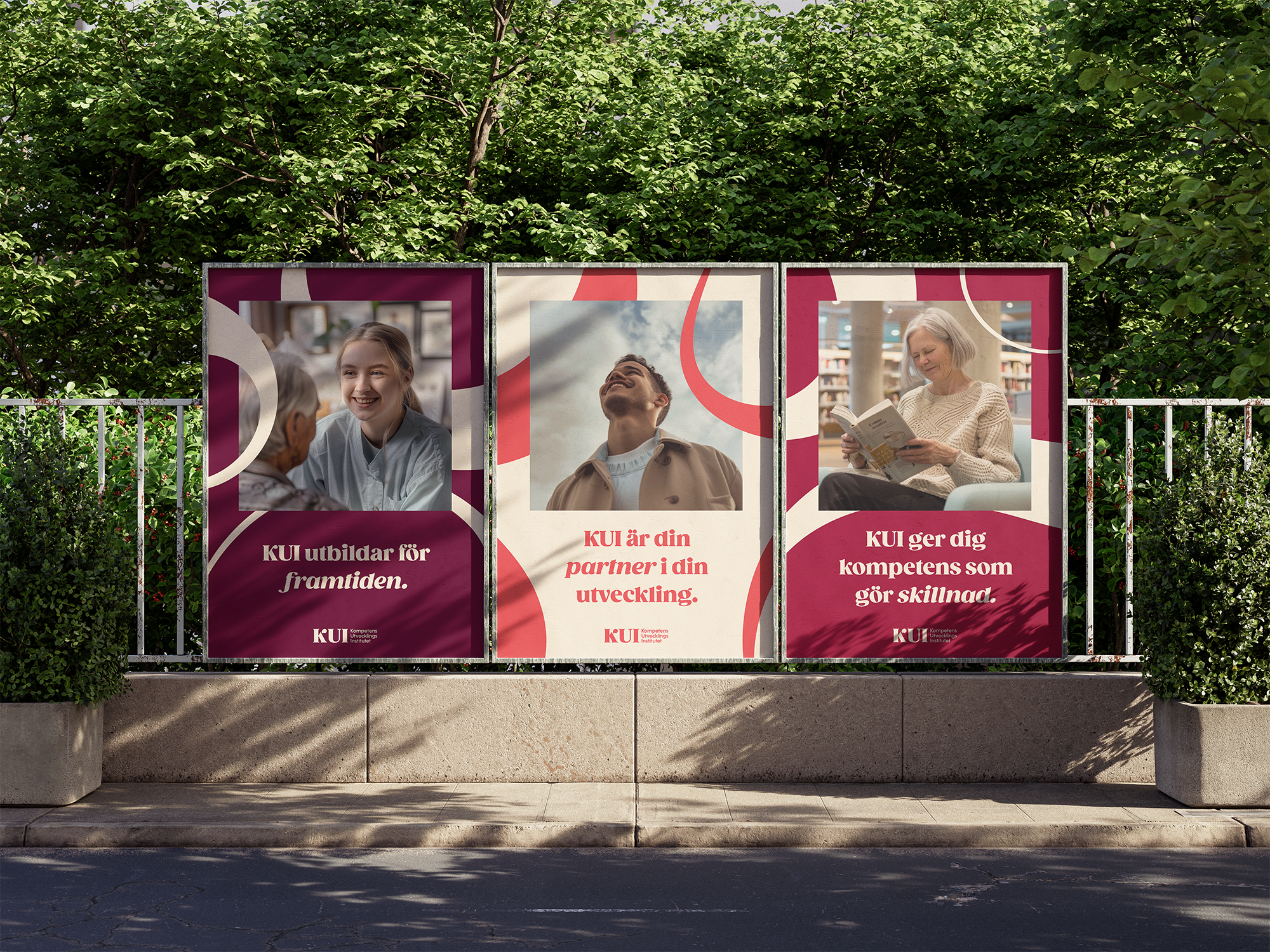
In this collaborative project, my role as a graphic designer was to work hands-on with the rebranding process. The goal was to modernize and redesign KUI’s visual identity to better reflect what they stand for — people-centered adult education. The new visual identity creates a sense of warmth and friendliness through a calming color palette, characteristic yet friendly typography, and round, dynamic graphic elements.
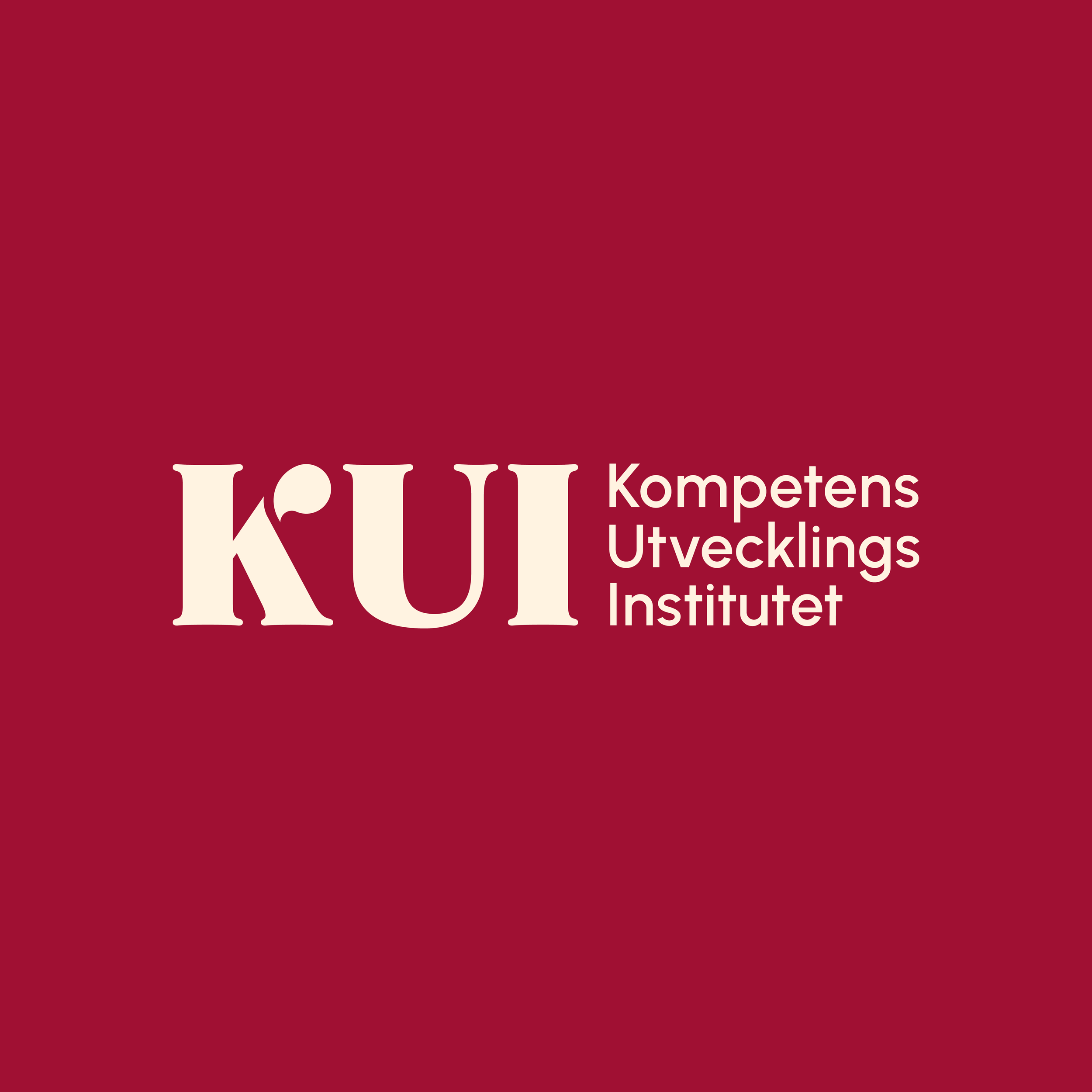
KUI’s old color palette was reworked, but we kept the idea of the red color, as it is an important recognition factor for KUI. We redesigned the logo, keeping it simple and reflective of healthcare.

